EMBER
ROLE
UX/UI designer
Duration
6 weeks, January-February 2024
TOOLS
Figma, Adobe XD, Miro, Usability Hub, Optimal Workshop
Overview:
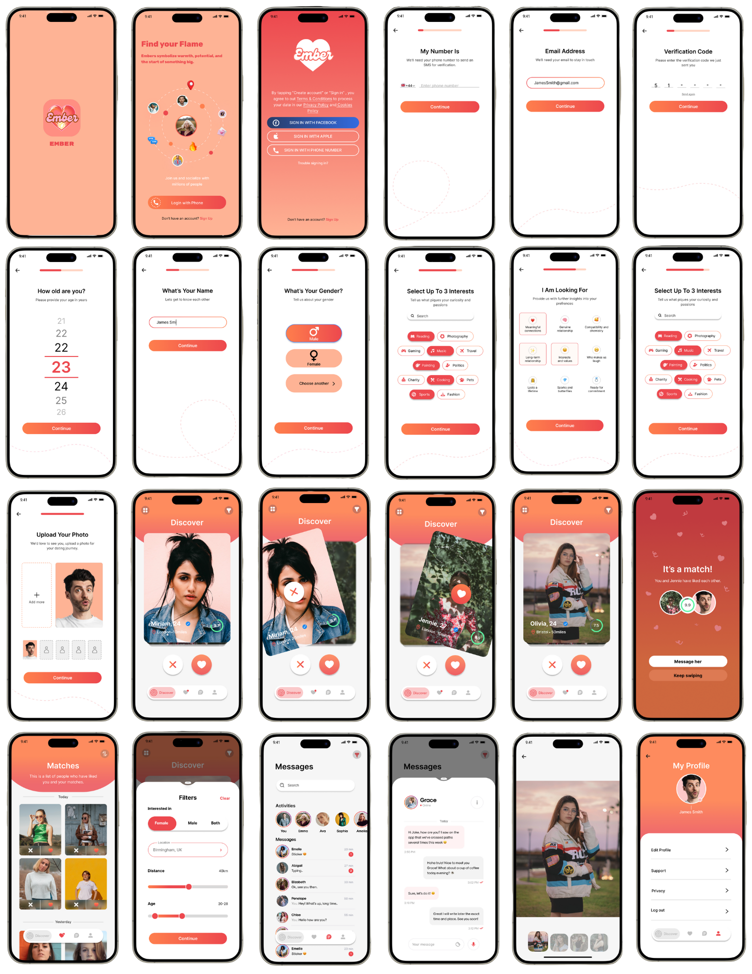
I designed Ember, a mobile dating app that helps people build meaningful connections through a safe and intuitive experience. The app includes personalised profiles, smart matching, in-app messaging, and profile verification to encourage genuine interactions. Every stage of the project, from user research and wireframing to high-fidelity UI design and prototyping, was completed by me. The app is designed to make online dating feel more authentic, accessible, and enjoyable while creating a seamless experience from onboarding to conversation.
Design Process

Discover
proto-persona
User Research
Affinity Diagram
Empathy Map
User Persona
Define
User Insight
Problem
Statement
Ideation
Feature
Prioritisation
Matrix
Ideate
Value Proposition
User scenarios
Storyboard
User Journey
Map
Competitive
Analysis
User Flow
Prototype
Sketch
Prototypes
Mid-fidelity
Wireframes
High-fidelity
Test
Guerilla Testing
Usability Testing
Iteration
Discover
Problem:
People struggle to form genuine connections on dating apps due to endless swiping and a lack of meaningful interactions.
I want to meet someone who genuinely shares my values, but most dating apps feel too focused on appearance rather than building meaningful connections.
Endless swiping makes it difficult to form genuine connections.
It’s hard to know if someone is looking for the same type of relationship.
Reasons for Using Dating Apps
To meet people outside of my usual social circle.
I’m looking for someone with similar interests and values.
Pain Points
Most matches stop replying after a few messages.
I don't feel completely safe meeting people from dating apps.
I don’t have many opportunities to meet new people in person.
I enjoy getting to know new people.
User Interviews
I conducted five user interviews to understand people’s experiences with dating apps and the challenges they face when building meaningful connections. The research revealed that many users found existing apps to be superficial, overwhelming, and lacked features that encouraged genuine relationships.
I get tired of endlessly swiping through profiles. I’d rather have an app that helps me find people I’m actually compatible with instead of just matching based on looks.
Affinity Diagram
To synthesise my research, I organised the interview data into an affinity diagram. This process uncovered key patterns in user behaviour, allowing me to prioritise the problems that mattered most and make informed design decisions throughout the Ember project.
Profiles focus too much on appearance instead of personality.
Conversations often feel repetitive and forced.
I want to find a meaningful relationship.
I want to build a genuine connection before meeting in person.
Empathy Map
To design a dating experience that genuinely reflected users’ needs, I created an empathy map based on insights from my interviews. As I developed it, I gained a deeper understanding of users’ frustrations with superficial swiping, their desire for meaningful connections, and the importance of feeling safe and understood when using a dating app. The empathy map became a valuable guide throughout the design process
Does
Scrolls through multiple profiles before deciding to match.
Reads bios to understand someone’s personality and interests.
Messages users but often stops chatting when conversations become repetitive.
Uses filters to find people with similar relationship goals and interests.
Takes time before agreeing to meet someone in person.
Pains
Endless swiping makes it difficult to build genuine connections.
Conversations often end after only a few messages.
Profiles focus too much on appearance rather than personality.
It’s difficult to know whether someone is looking for the same type of relationship.
Safety concerns make meeting people from dating apps feel intimidating.
Says
“I want to meet someone who shares my values, not just my interests.”
“I’m tired of endless swiping that never leads anywhere.”
“I wish dating apps focused more on personality than appearance.”
“Feeling safe is important when talking to and meeting new people.”
Thinks
Compatibility is more important than physical attraction alone.
Better conversation starters would make it easier to connect.
Verified profiles would create a safer experience.
A smaller number of high-quality matches is better than endless options.
Maya Ahmed
25 years old
Marketing Executive
Maya, a 25-year-old marketing executive, enjoys trying new cafés, travelling and spending time with friends. Although she’d like to find a meaningful relationship, she finds most dating apps repetitive and superficial. She wants a dating app that prioritises genuine conversations, shared values and a safe environment to build lasting connections.
Solution:
Ember encourages more intentional connections through thoughtful prompts, personality-focused profiles, and features designed to help users build authentic relationships beyond first impressions.
What Dating Means to Users
Dating is about building a genuine connection with someone.
I want to find a long-term relationship rather than casual dates.
I want to feel safe and comfortable when meeting new people. Features that verify users and encourage genuine conversations would make me more confident using a dating app.
Features Users Wished For
Better matching based on personality and values.
Daily curated matches instead of endless swiping.
Compatibility scores based on shared interests.
User Persona
Using my research findings, I created a user persona to represent the needs, behaviours and goals of Ember’s target users. This persona guided me throughout the design process, ensuring I remained focused on creating a dating experience that prioritised meaningful connections, compatibility and user safety.
Goals
Find a meaningful, long-term relationship.
Build genuine connections with people who share similar values and interests.
Feel confident and safe when meeting new people.
Behaviour
Uses dating apps a few times a week.
Reads profiles carefully before matching.
Enjoys travelling, trying new cafés and spending time with friends.
Prefers getting to know someone through conversation before meeting in person.
I want to meet someone who shares my values and interests.
Good communication is more important than physical attraction.
Conversation prompts to help break the ice.
Built-in safety features for arranging first dates, profile verification for increased safety.
Dating should feel intentional, not like a game.
Filters for relationship goals and lifestyle preferences.
More detailed profiles that showcase personality.
Gains
Find meaningful relationships based on shared values and interests.
Feel confident and safe when meeting new people.
Spend less time swiping and more time connecting with compatible matches.
Enjoy more engaging and natural conversations.
Use a dating app that feels intentional rather than superficial.
Feels
Frustrated when conversations quickly lose momentum.
Overwhelmed by the number of profiles and constant swiping.
Excited about the possibility of finding a meaningful relationship.
Hesitant to trust strangers online without verification.
Needs / Expectations
Wants better matches based on compatibility rather than appearance.
Expects a safe and trustworthy dating experience.
Wants meaningful conversations that lead to genuine connections.
Pain Points
Finds endless swiping repetitive and time-consuming.
Gets frustrated when conversations quickly fade or receive no replies.
Struggles to find people looking for the same type of relationship.
Feels that many dating apps prioritise appearance over personality and compatibility.
Define
User Insight:
Maya is a young professional looking for a meaningful relationship. She needs a dating app that helps her build genuine connections because she is tired of superficial swiping and wants to meet people who share her values, interests, and long-term goals.
Ideate
Problem Statement:
Our dating app’s goal is to help users build meaningful and authentic relationships. We have observed that users are frustrated with endless swiping and struggle to find compatible matches who share their values. We believe that by prioritising compatibility, shared interests, and meaningful conversations, we will create a more genuine and enjoyable dating experience.
User Journey Map
To design an intuitive and user-friendly dating app, I created a user journey map for Ember’s core features. The aim was to understand how users navigate the app, from creating a profile and discovering potential matches to chatting and building meaningful connections. Mapping each stage of the journey helped identify user goals, pain points, and opportunities to improve the overall experience, ensuring the app feels seamless, engaging, and easy to use throughout.
Maya Ahmed
25 years old
Marketing Executive
The Experience
User Scenario
Maya had grown tired of using dating apps that focused on endless swiping and superficial matches, making it difficult to build genuine connections. After discovering Ember, she found an app designed to encourage more meaningful interactions through compatibility-based matching, thoughtful profile prompts, shared values, and conversation starters. As a result, Maya felt more confident connecting with like-minded people, enjoyed more engaging conversations, and found the dating experience more authentic and intentional.
Upon opening the app, the user is welcomed with Ember’s onboarding screens, introducing the app’s purpose and key features before selecting Get Started.
The user creates an account and verifies their details, allowing them to personalise their profile and securely access the platform.
After signing up, the user completes their profile by adding photos, writing prompts, interests, and relationship preferences to help improve match compatibility.
Once their profile is complete, the user is taken to the homepage, where they can begin discovering potential matches based on their preferences.
The user browses compatible profiles and views shared interests, values, and profile prompts before deciding whether to like or pass.
When two users like each other, a match is created and they are encouraged to start a conversation using suggested conversation starters to make messaging feel more natural.
The homepage continues to recommend compatible matches while displaying new matches, recent activity, and messages, making it easy for users to stay engaged.
The user can navigate using the bottom navigation bar to access their matches, conversations, profile, and settings at any time.
As the user continues using Ember, they can build meaningful connections, update their profile, manage conversations, and discover new compatible matches through a seamless and intuitive experience.
Opportunities
Find meaningful connections through personality-based matching instead of appearance alone.
Competitor Advantage
Strengths
Weaknesses
Feature Prioritisation Matrix
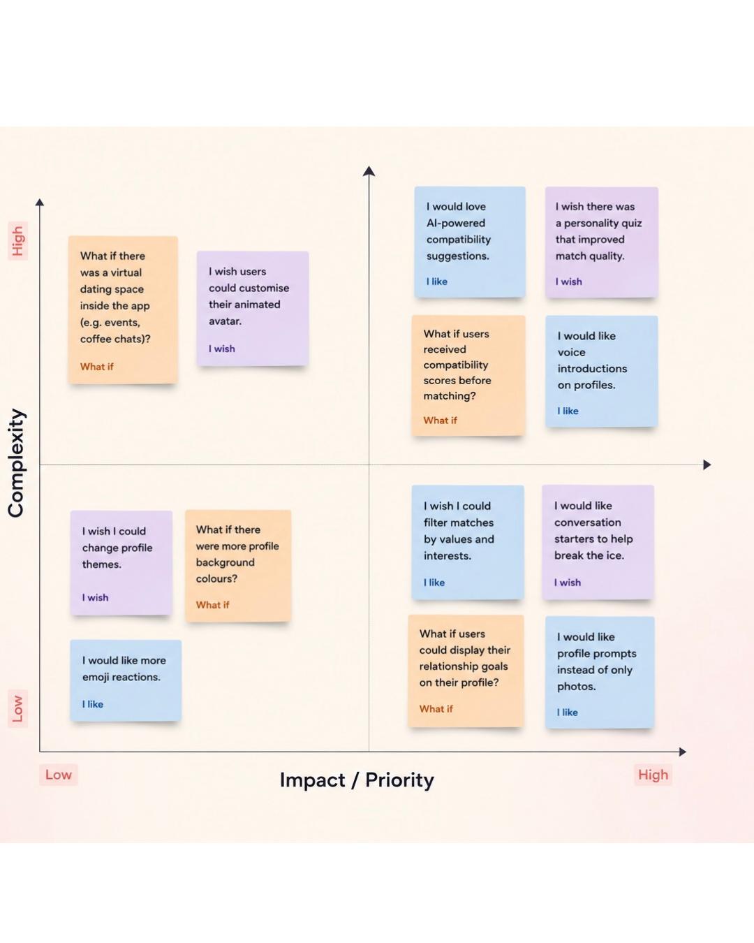
I used the ‘I Like, I Wish, What If’ method to gather user feedback and identify areas for improvement within Ember. This valuable insight allowed me to prioritise the features that users valued most and address common frustrations with traditional dating apps. Using a feature prioritisation matrix, I organised the feedback based on user impact and implementation complexity, helping me identify the most valuable features to include. As a result, Ember delivers a more intentional, meaningful, and user-centred dating experience that better meets the needs of its users.
During the ideate phase:
I analysed user needs and preferences by creating value propositions, user scenarios, a user journey map, and a storyboard. These activities helped me understand users’ motivations, expectations, and frustrations when using dating apps, allowing me to explore solutions that encourage genuine connections and create a more enjoyable dating experience. This user-centred approach ensured that every feature was designed to address real user needs, resulting in a more engaging and intuitive product. By completing this essential groundwork during the Ideate phase, I established a strong foundation for designing a dating app that aligns with users’ goals, expectations, and overall experience.
Break the ice with conversation starters designed to make chatting feel natural.
Build trust with profile verification and safety features before meeting someone.
User Flow
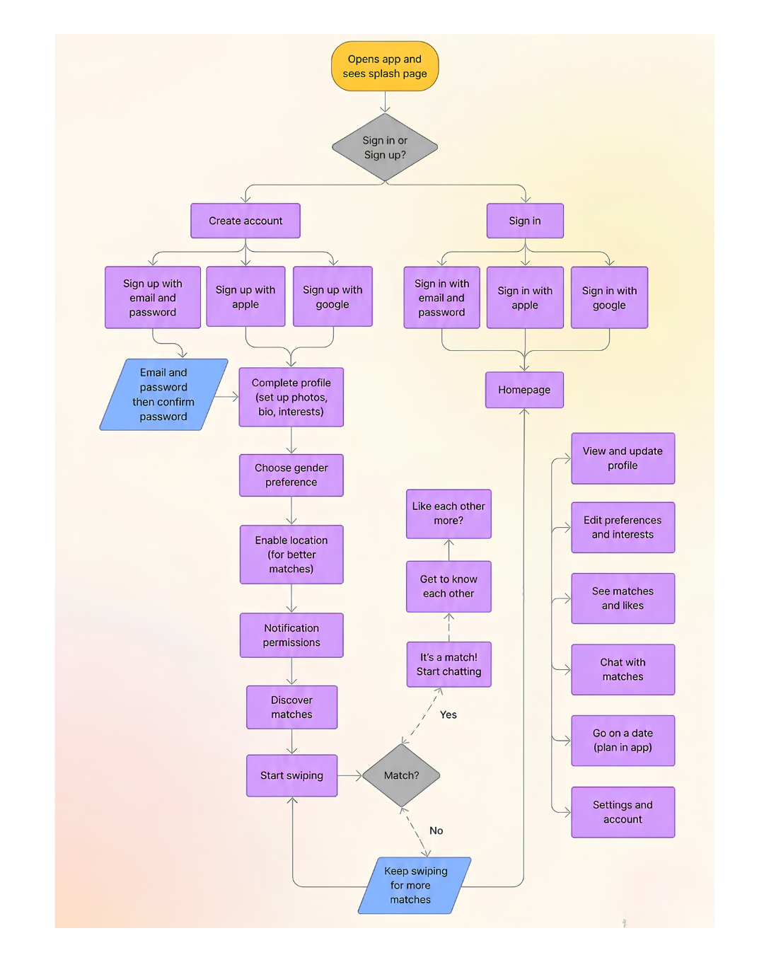
I designed a user flow for Ember’s core features to understand how users would navigate the app, from creating an account to discovering and connecting with potential matches. Mapping the user journey helped me create a seamless and intuitive experience, ensuring users could easily complete key tasks and interact with the app with minimal friction.
Goal
The user is looking for a dating app that helps them build genuine, meaningful relationships rather than focusing solely on appearance. They want an experience that matches them with people who share similar values, interests, and relationship goals, while providing features that make starting conversations feel natural and comfortable. Additionally, the user wants a safe, trustworthy, and engaging platform that encourages authentic connections and creates a more enjoyable online dating experience.
Discover compatible matches based on shared values, interests and relationship goals.
Direct Competitors
Feature Analysis
Competitor Analysis
To better understand the online dating market, I conducted a competitor analysis of existing dating apps. This involved evaluating their strengths, weaknesses and overall user experience to identify gaps and opportunities for Ember. By analysing what competitors do well, as well as the common frustrations users experience, I gained valuable insights into how Ember could stand out. These findings informed my design decisions, allowing me to create a more intentional, meaningful and user-centred dating experience that focuses on genuine connections rather than endless swiping.
Hinge

Profile prompts that encourage users to showcase their personality.
Users can like and comment on specific parts of a profile.
Compatibility is based on preferences and interests.
Voice notes and video prompts add authenticity.
“Your Turn” reminders encourage users to reply to conversations.
Designed around meaningful relationships rather than endless swiping.
Detailed profiles help users understand someone’s personality before matching.
Conversation starters make it easier to break the ice.
Strong matching algorithm based on preferences and interactions.
Encourages deeper conversations through prompts.
User-friendly and visually appealing interface.
Focuses on quality matches over quantity.
Profile interactions feel more personal than traditional swiping.
Many useful features require a premium subscription.
Users can still judge profiles heavily based on appearance.
Limited daily likes on the free version.
Some prompts become repetitive across different profiles.
Bumble

Create genuine relationships in a calm, distraction-free experience without endless swiping.
Women make the first move in heterosexual matches.
Video and voice calling within the app.
Photo verification to reduce fake profiles.
Interest badges and profile prompts.
Friendship and networking modes alongside dating.
Safety-focused features, including verification and blocking tools.
Gives users more control over who starts conversations.
Offers multiple ways to connect beyond dating.
Clean, modern interface that is easy to navigate.
Strong emphasis on user safety and respect.
Simple and intuitive user experience.
Verification features help build trust.
Encourages more intentional conversations.
Premium membership is needed for many advanced features.
Matches can expire before users have a chance to reply.
Some users find starting conversations intimidating.
Friendship and networking features can make the app feel less focused on dating.
Prototype / Test
Sketch Prototype
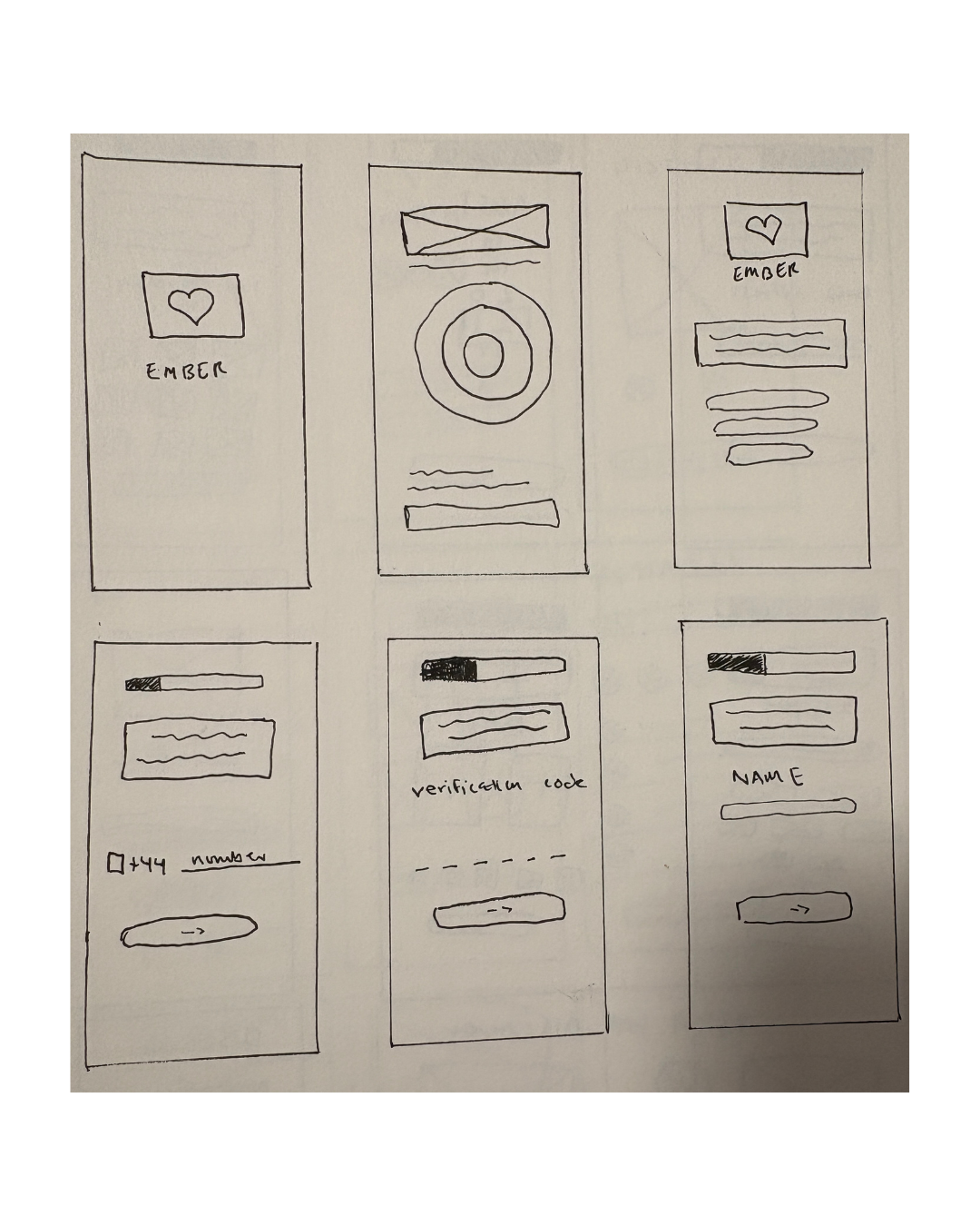
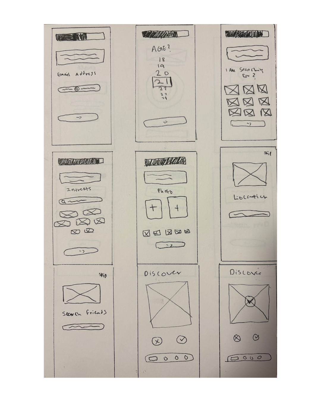
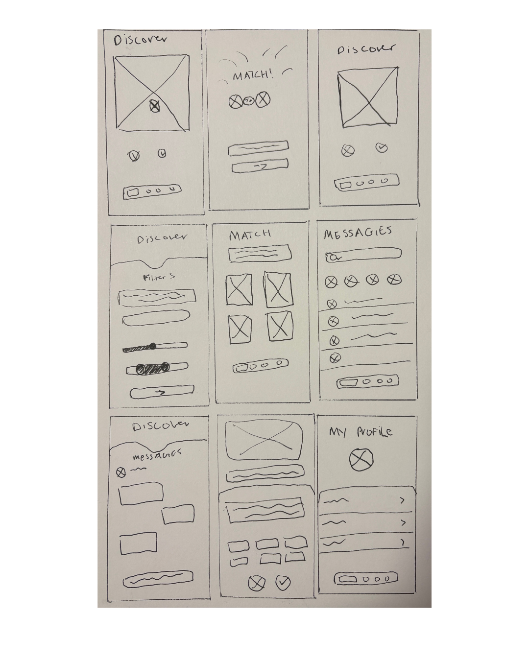
As part of the design phase, I created low-fidelity wireframe sketches to plan Ember’s user interface, navigation, and core features. This allowed me to visualise how users would move through the app, from creating a profile to discovering, matching, and chatting with potential connections. I then turned these sketches into an interactive prototype and conducted usability testing by observing users as they completed key tasks and identifying areas of confusion or friction. Based on the feedback, I refined the design and produced a mid-fidelity wireframe in Figma before carrying out another round of testing to evaluate whether the changes improved the overall user experience.
Final High fidelity
After multiple rounds of usability testing and design iterations, the hi-fi prototype was finalised to deliver a seamless user experience. The onboarding flow was refined to create a smooth and welcoming introduction, while the matching and profile features were improved based on user feedback. Ember makes online dating feel more intentional by encouraging meaningful connections through compatibility-focused features and thoughtful interactions. The final product is an intuitive and engaging platform that helps users build genuine relationships with confidence and ease.
Style Guide
I adhered to the iOS guidelines for this app, utilising icons. Additionally, I implemented the recommended iOS colour palette to ensure a cohesive visual design.
Colour Palette
Final Reflections
Throughout the project, I continuously refined the user flow, improved the interface, and introduced features that encourage more meaningful and intentional connections. User feedback played a key role in shaping the final design, helping me create a smoother and more intuitive experience. I also followed accessibility guidelines for colour contrast, typography, and navigation to ensure the app is inclusive and easy to use. Overall, I’m proud to have designed a thoughtful, user-centred dating app that balances functionality with an engaging experience while meeting the needs of its target audience.